
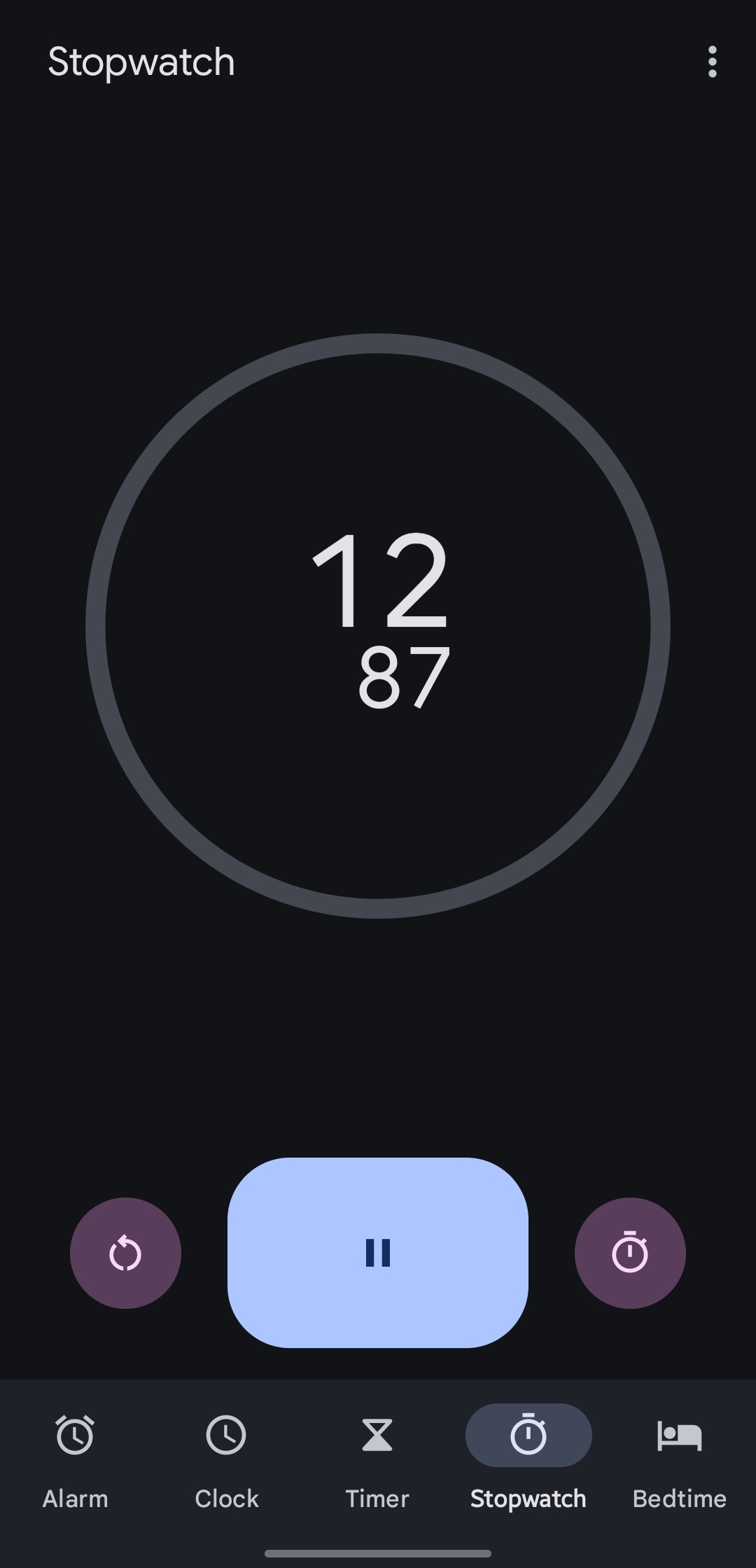
One of the buttons laps the stopwatch, the other resets the entire session clearing all lap markers and stopping the counter. Better not forget which is which, especially given that you’re probably timing something in the physical world not paying much attention to your phone…
I think worse is the alarm clock, where snooze and stop are the same size and shape, and hard to tell apart when you are half asleep
Dude I struggle with this all the time! The symbols are way too similar to each other and I occasionally find myself turning off the alarm when I meant to snooze.
On top of that, I swear the UI changes 1-2 times per year with software updates. It’s hard to pinpoint since I’m usually 90% asleep when interacting with the alarm, but I know it has changed from tap to swipe and switched sides at least once since I got my last phone in 2022.
There is absolutely no reason for that shit. If you look at an old school alarm clock, the snooze button is the size of a small country, and there is usually a much smaller button or sliding switch to make damn sure you meant to turn the alarm off.